 Sign-up for free online course on ANSYS simulations!
...
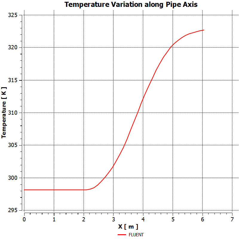
Click Apply. You will see Centerline Temperature created under Report in the Outline tab.
| Info | ||
|---|---|---|
| ||
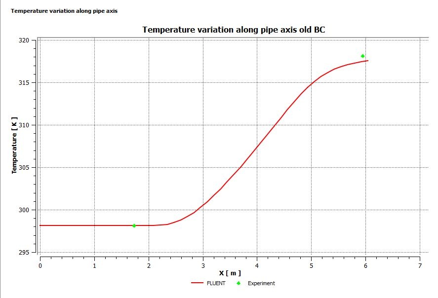
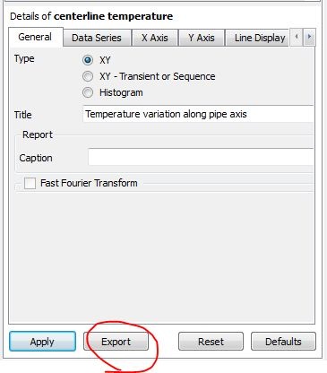
You need to repeat the FLUENT simulation with inputs from YOUR MEASUREMENTS in the lab. To compare the FLUENT results with experiment, you can export the FLUENT result into Excel. A sample comparison is shown below. You can export the FLUENT data in Excel format by clicking on the Export button in "Details of centerline temperature"
|
Wall Temperature Plot
| HTML |
|---|
<iframe width="560" height="315" src="https://www.youtube.com/embed/-Cvn7HPp9eY?rel=0" frameborder="0" allowfullscreen></iframe> |
...
- Create location > Line
- Point 1: (0,.0294,0) Point 2: (6.045,.0294,0)
- Create Chart
- Under Data Series > Location Select line you just created
- X Tab
- Plot X location
- Y Tab
- Plot Temperature
...
| title | Note to Cornell MAE 4272 Students: |
|---|
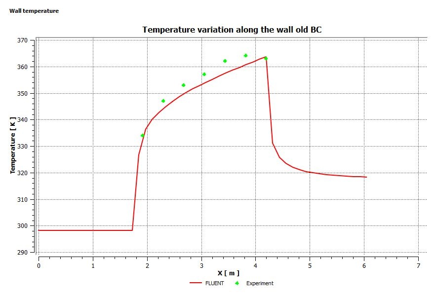
You need to repeat the FLUENT simulation with inputs from YOUR MEASUREMENTS in the lab and compare the FLUENT results for the wall temperature with experiment. A sample comparison is shown below.
...
Importing Experimental Data and Chart Formatting
...
- In details of Chart > New Series > Import Data from file
- Find file and click okay
- Change how experimental data looks in CFD Post
- In Line Display under Series 2 > No Line > Symbols > Ellipse
- Chart Details > General
- Give TItleTitle
- Chart Details > Chart Display
- Font Sizes
- Grid Sizes
...
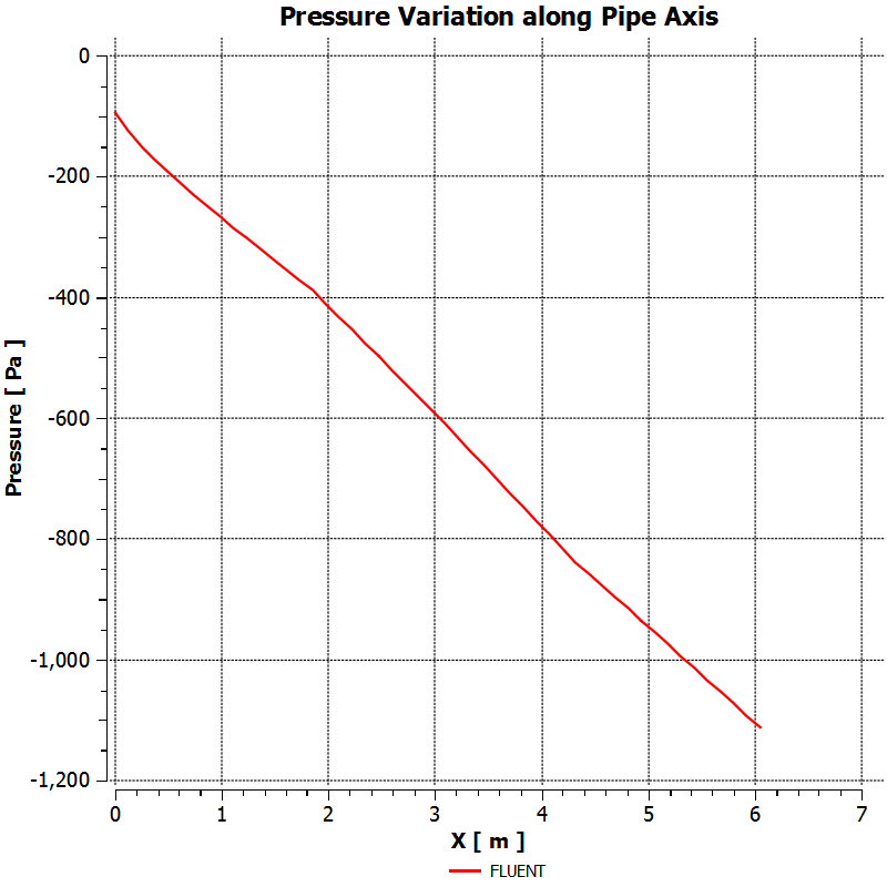
Follow steps from the Centerline Temperature plot above, making appropriate modifications. You should see the following plot.
| Info | ||
|---|---|---|
| ||
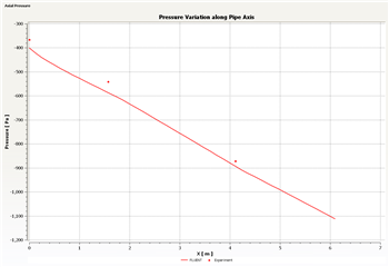
You need to repeat the FLUENT simulation with inputs from YOUR MEASUREMENTS in the lab and compare the FLUENT results for the pressure with experiment. A sample comparison is shown below. |
Axial Velocity Profiles
Let's look at the velocity profiles before and after the heated section. To do this, we need to first create lines at x=1.83 m ((start of heated section), x=4.27 m (end of heated section) and x=6.045 m (end of mixing section).
First, create the line at x=1.83 m.
Insert > Location > Line
Name it "x183" and click OK. Enter the following coordinates (0.0294 m is the pipe radius).
Point 1 (1.83, 0, 0)
Point 2 (1.83, 0.0294, 0)
Enter 100 for Samples. Click Apply.
Similarly create lines at x=4.27 m and x=6.045 m.
Insert > Chart
Name this chart "Axial Velocity Profiles".
Select the General tab and name the chart "Axial Velocity Profiles".
Select Data Series tab. Change the name of the first data series to x=1.83 m. Under Data Source, specify x183 as Location.
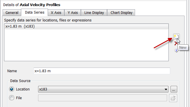
Add a new data series by clicking on the "New" icon as shown below and repeat the above steps but for x=4.27 m.
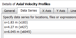
Add a third data series by clicking on the "New" icon and repeating the steps for x=6.045 m. You should then have three items in the Data Series tab.
Specify x-axis variable: Velocity u
Specify y-axis variable: Y
Complete the plot. Here's what we get.
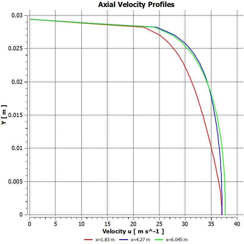
We notice that the flow accelerates due to the heating. As air is heated, its density decreases. So the velocity has to increase to maintain the same mass flow rate.
Mixed Mean and Wall Temperatures
From energy conservation, we can show that the mixed mean temperature is constant in the flow development and mixing sections and varies linearly in the heated section. This is shown schematically in the following figure from the MAE 4272 lab manual.
...
- Create a line at x = 2.67
- Go to Expressions, right click and click New
- Name Tw267
- Right click in Definition box > Functions > CFD-Post > maxVal
- Right click within the parenthese of maxVal > Variables > Temperature
- Right click after the @ sign > Locations > x267
- Click Apply
Nusselt No.
To calculate the Nusselt no.:
...
Wall Shear
We plot the wall shear using the procedure shown in the video below.
| HTML |
|---|
<iframe width="640" height="360" src="//www.youtube.com/embed/WiK1uBTdK-M?rel=0" frameborder="0" allowfullscreen></iframe> |
Summary of the above video:
- Click on the Chart Viewer tab
- Click chart in the top toolbar
- Name it Wall Shear
- Click on Data Series Tab
- In Location dropdown menu, choose Wall
- Click o nX on X Axis tab
- under Variable, choose X
- Click on Y Axis tab
- under Variable, choose Wall Shear X or Wall Shear
- Click Apply
- Go to Location in the tree
- Double click on Wall
- Increase Sampling from 50 to 200
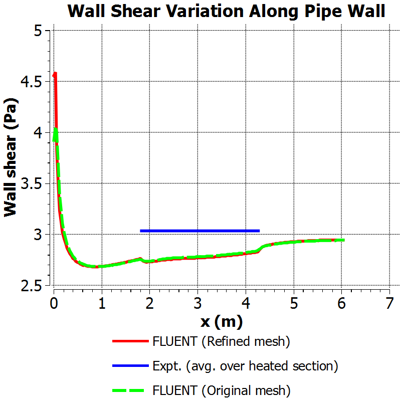
We then consider the trends in the wall shear in the heated, mixing and flow development sections and try to justify them through physical reasoning.
| HTML |
|---|
<iframe width="640" height="360" src="//www.youtube.com/embed/NbdGrJTesZg?rel=0" frameborder="0" allowfullscreen></iframe> |
Summary of the above video:
- As you heat flow, velocity increases
- Momentum at any any average is going to increase when heat is added
- The gradient of the velocity normal to the wall is higher, the wall shear is higher
- Wall shear increases in the heated region, as shown in the wall shear plot
You can spiff up your plot using the tips discussed below. This video also shows you how you could read in experimental results for comparing the wall shear between simulation and experiment.
| HTML |
|---|
<iframe width="640" height="360" src="//www.youtube.com/embed/6RNykoM86xA?rel=0" frameborder="0" allowfullscreen></iframe> |
Summary of the above video:
- To edit how the Wall shear graph is displayed
- Select Wall shear in tree
- Click on General, check Title and enter title in Title blank
- in Data Series, enter series name in Name blank
- in X Axis, enter x axis label in Custom Label blank
- same for Y Axis
- in Line Display, uncheck "Use series..." and type within Legend Name blank
- in Chart Display, under Sizes, toggle with the line sizes and fontsApplyfont
- To add another data series
- go to Data series tab of Wall Shear
- click on New button
- Scroll down, click File as Data Source
- Browse for csv file
- Apply> browse for your file
- To export the chart
- Click the button next to undo
- Select location to save
- Rename
When the simulation was repeated for conditions for which experimental data are available, we got the comparison shown below. The difference in the average wall shear in the heated section between the simulation and experiment is a respectable 4%. Note that the wall shear in turbulent flows is difficult to predict accurately due to the steep velocity gradients at the wall.
Fanning Friction Factor
The Fanning friction factor, also called the skin friction coefficient, can be plotted using the procedure outlined below.
| HTML |
|---|
<iframe width="640" height="360" src="//www.youtube.com/embed/Jcht7CAPzAc?rel=0" frameborder="0" allowfullscreen></iframe> |
Summary of the above video:
- Create Location > Point
- (2.67, .0294, 0)
- Probe wall shear at point:
- Create Expression > Right Click > New Expression
- probe(Wall Shear)@w267 / 1.483 (Pa/K) /Tm267
- Can duplicate for different locations for a plot
Final Plots
| HTML |
|---|
<iframe width="560" height="315" src="https://www.youtube.com/embed/x-flaXXU7xg?rel=0" frameborder="0" allowfullscreen></iframe> |
Summary of the above video:
- Display Wall Temperature vs. Position in pipe and compare with experimental data
- Display Pressure Variation vs. Position in pipe and compare with experimental data
- Display Temperature at Centerline vs. Position in pipe and compare with experimental data
...