 Sign-up for free online course on ANSYS simulations!
...
Velocity vectors in the first section showing flow development.
Pressure Plot
Now let's us look at the pressure variation at the centerline. First, we will create a line call centerline.
Insert > Location > Line
Name it "Centerline" and click OK. On the lower left panel, you will see Details of Centerline. Enter the following coordinates.
Point 1 (0,0,0)
Point 2 (6.096,0,0)
Enter 50 for Samples. (This will be the number of sample points used when plotting data)
Click Apply. 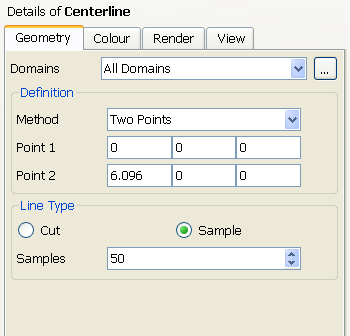
You will see centerline created under User Locations and Plots.
Next, we will create a chart using this Location data.
Insert > Chart
Enter "Axial Pressure" as Name. You will see Details of Axial Pressure appear on the lower left panel. Under General, give the chart Title as "Pressure Variation along Pipe Axis".
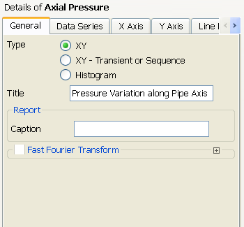
Now click on Data Series tap to specify the location of the chart data. Create a new data series. Under Data Source, specify Centerline as Location.
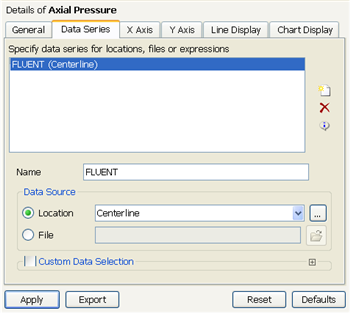
Now we will specify the X Axis parameter. Click on X Axis tab. Next to Variable, choose X.
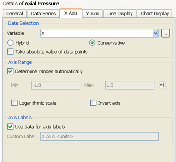
Click Apply. You will see Axial Pressure created under Report in the Outline tab. In the Graphics window, you will see the chart.
Go to Step 7: Verification & Validation
...